

Create custom dashboards
You don't build charts in Owl PM by configuring axes and dragging fields. You describe the view you want, and Owl writes the analytic from your live schedule data. Group a few analytics together and you have a dashboard you can re-run against any schedule or scenario — a standing view for status meetings, client updates, or your own tracking.
Note: Analytics and dashboards are a Pro feature. If you don't see the Analytics and Dashboards sections in the project tree, they're gated on your plan.
Step 1 — Ask Owl for a chart
Describe the analytic in plain language. Say what to measure, how to group it, and (optionally) where to put it.
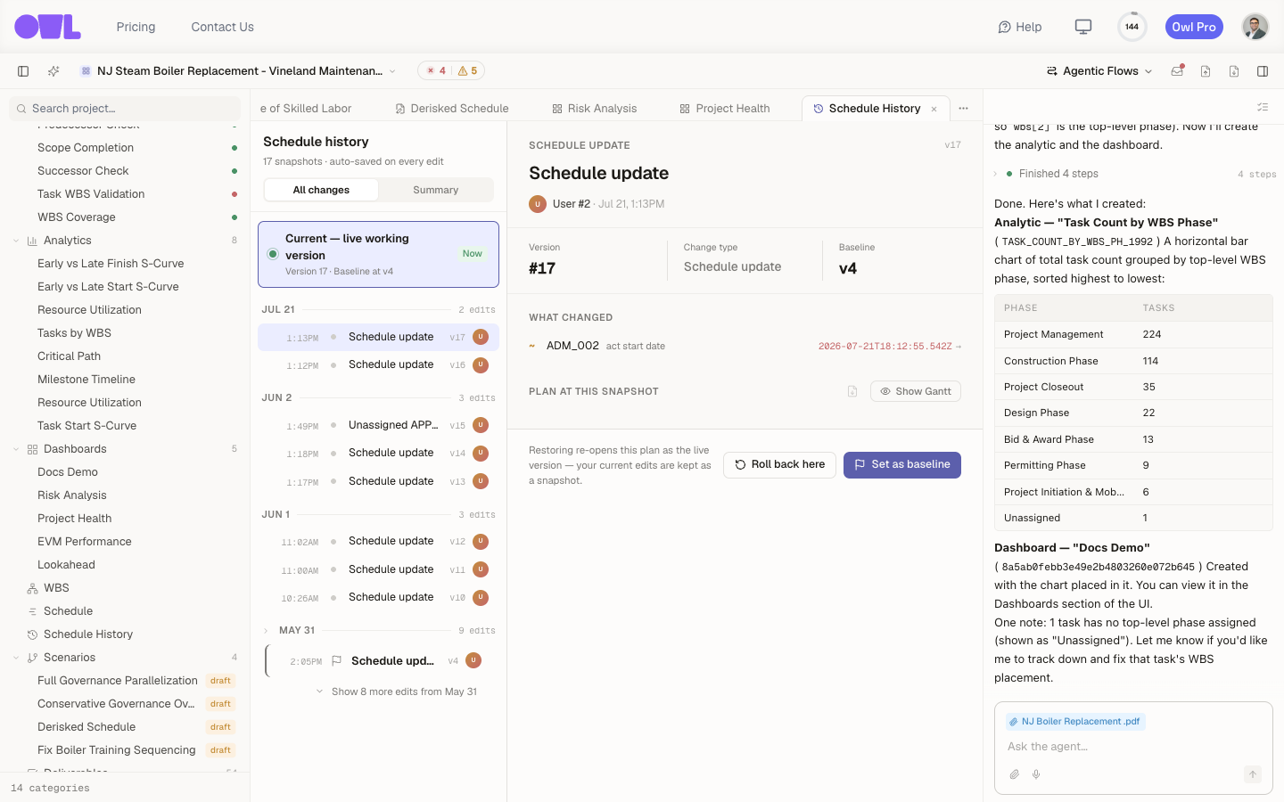 121Owl built the analytic Task Count by WBS Phase and computed the counts from the live schedule right in the chat.2The new Docs Demo dashboard appears under Dashboards in the project tree.
In the example above the request was "Create a bar chart of total task count by top-level WBS phase, and add it to a new dashboard called Docs Demo." Owl built the analytic (Task Count by WBS Phase, a horizontal bar chart), computed it from the live schedule — Project Management 224, Construction Phase 114, Project Closeout 35, and so on — and placed it in a new Docs Demo dashboard. It also flagged a data quirk it noticed along the way (one task with no top-level phase).
New analytics appear under Analytics in the project tree; dashboards appear under Dashboards.
Step 2 — Compose and read a dashboard
A dashboard is a set of analytics shown together, with controls across the top. Owl can build a whole dashboard in one request, or you can add analytics to one over time.
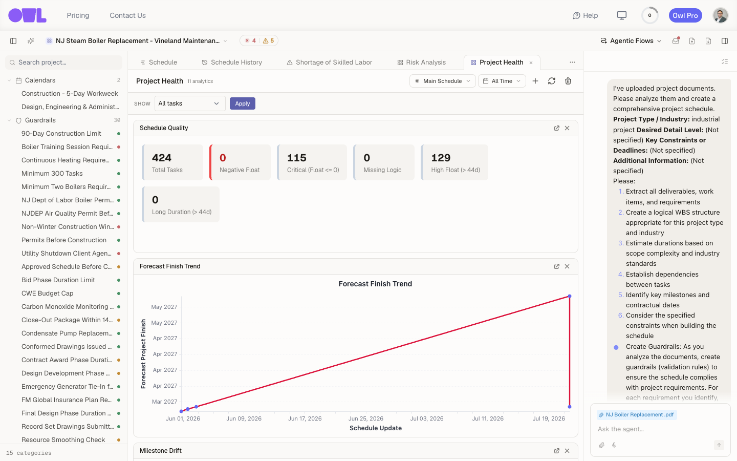 1231The Schedule Quality tiles grade the plan at a glance — total tasks, negative float, critical path, and missing logic.2The Forecast Finish Trend chart tracks how the projected finish has moved across updates.3Header controls point the whole dashboard at a different schedule or scenario, set a date range, and re-run all analytics.
The Project Health dashboard above combines KPI tiles and charts. The Schedule Quality tiles grade the plan at a glance — 424 total tasks, 0 with negative float, 115 on the critical path, 0 missing logic — and the Forecast Finish Trend chart tracks how the projected finish has moved across updates. The controls in the header let you point the whole dashboard at a different schedule or scenario, set a date range, filter which tasks are included, and re-run all analytics to refresh against the current data.
Step 3 — Keep them current
Dashboards read live data, so they stay useful as the project moves:
- Re-run a dashboard to refresh every analytic after a schedule change.
- Point it at a scenario to see the same metrics for a what-if plan, then compare.
- Ask Owl to adjust an analytic — change the grouping, add a series, switch a bar chart to a line — the same way you created it.
Tip: Build the dashboard once and reuse it every reporting cycle. When the schedule updates, one re-run brings every chart current — no rebuilding, no re-exporting.
What to do next
- Report risk alongside progress — add the Risk Analysis view (P10 / P50 / P90) to a client-facing dashboard.
- Grade every update — pair a dashboard with an audit so each schedule revision is scored automatically.